Flight Booking Flow
To design an easier way to book flights on a mobile app
Completed as part of my Diploma from the UX Design Institute, I focused this project around designing a new mobile app for a fictional company. For my case study I chose to design an airline app, focusing on the process of booking flights.
Overview
The goal of the project was to design and build a working prototype that could be tested with users. In order to achieve this I would go though the full UX process from research & analysis to building a working prototype & annotating it for handover.
Goal
Role
Other than two usability tests which were provided by the UX Design Institute, I was the only person who worked on this.
Tools
I used tools that were familiar to me and are industry standard such as Figma and Miro to complete this project.

‘The Golden Thread’
A common link was set out early on in this process, The Golden Thread. This is a set of ideas and concepts based on the UX process which helped to focus and inform the design thinking and work that went into the later stages of the process.
UX is a problem-solving discipline.
It’s about understanding users’ problems and designing software to help solve those problems.
UX is a process.
It reduces the risk of building unnecessary software and the risk of project failure.
UX is a research-based discipline.
You can’t solve people’s problems if you don’t know what those problems are. If you’re not doing research you’re not doing UX.
Qualitative research is more valuable to UX designers than quantitative research.
It provides richer insights into users’ goals, behaviours, and context. If you’re solely relying on quantitative data you’re not really doing research.
Users don’t care about our software products.
They only care about what the product can do for them. They want to flow through our software as smoothly as possible and get to the other side: the job done, the problem solved.
UX is a tool for minimising risk.
It minimises the risk that we waste time, the risk that we waste money, and the risk that we build poor quality products.
The Process
With the goal to design and build a working prototype that can be tested, I went through the full UX design process:
Research
Analysis
Concept
Design
As we progress through this case study we’ll dive into each step in more detail.
First things first, let’s start with the most important step, research to discover the problem.
Navigating the Competition
Research
I began with competitor benchmarking, choosing three airlines with audiences that overlap slightly, but typically would be considered to have different customers.
easyJet - Wide range of customers, from leisure to business
British Airways - Business & high income travellers
Wizz Air - A younger, more price conscious traveller
During the benchmarking process, I kept the following questions in mind:
How do these apps solve the problem?
What are they doing well? Is there anything that can be emulated?
What are they doing badly? How can it be done better?
Have any design conventions been established? If so, should they be followed?
This initial research was a great way to discover some best practises and common themes from some of the biggest brands in the airline space. It also helped to answer some of the questions above by discovering design patterns and app features that could be referred back to when it comes time to start designing my app.
Research
Streamlining Travel
I observed two participants complete the same booking journey for two different apps, Aer Lingus and Eurowings.
These tests helped me to discover the users behaviours, motivations, positive interactions, pain points and mental models as they progressed through the app. This research started to reveal some reoccurring pain points as users completed the journey.

"I don’t know why the other one is showing if it’s not available… If I can’t book it then I don’t need to know about it”
Participant 2 - Eurowings usability test
“It doesn’t say anything about a stop over here. What I clicked on looked direct”
Participant 2 - Eurowings usability test
“Saver presumably is Economy, I actually don’t know what the Plus or Advantage what the difference is.”
Participant 1 - Aer Lingus usability test
Analysis
Patterns in the Clouds
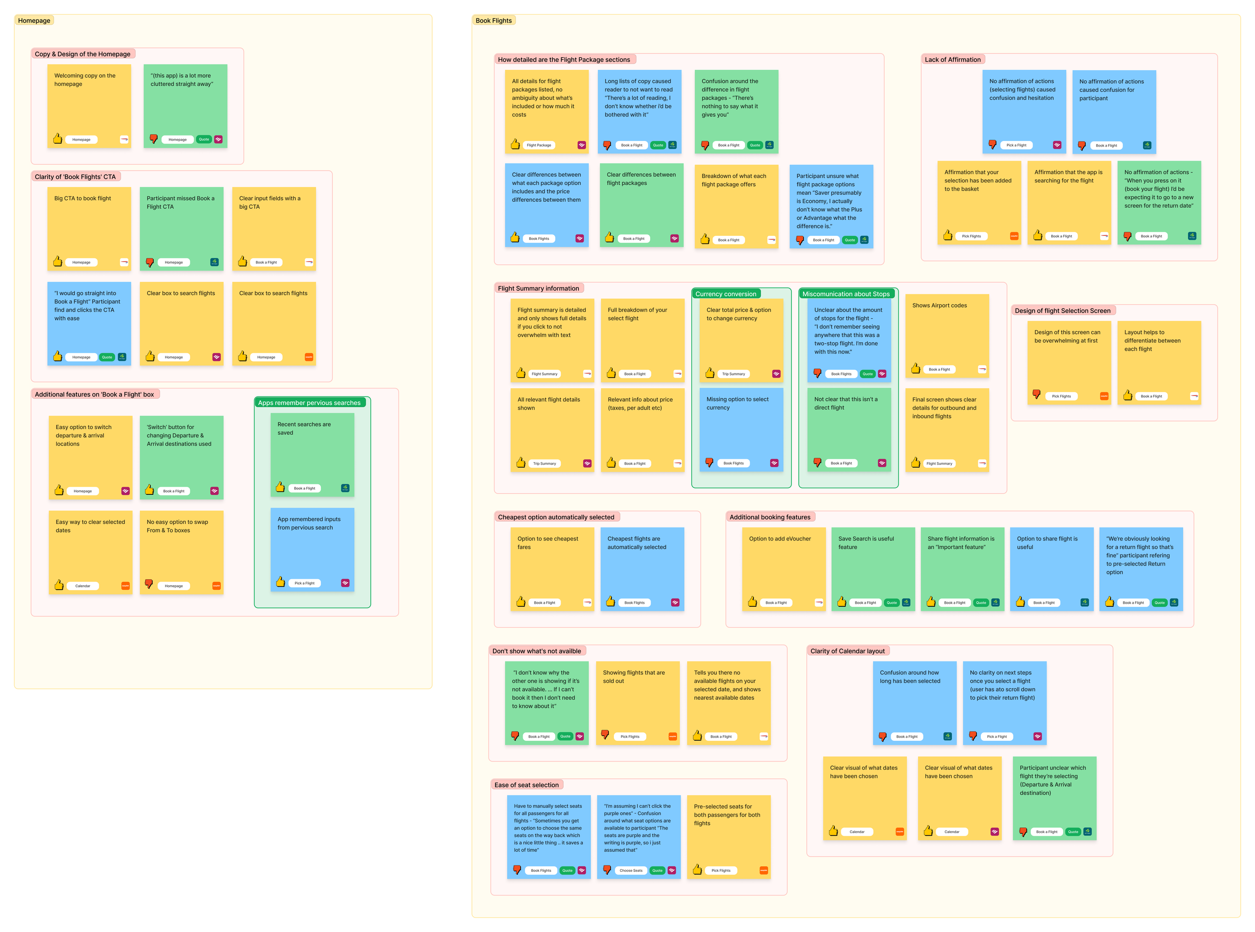
To organise the raw data gathered from the research, I conducted an affinity diagram.
Grouping notes based on their similarities and relationships helped to drill down into specific areas of the journey making the research easier to analyse and act on.
Analysis
The Travel Journey
This customer journey map was created to help visualise the experience an average user has at each step along the booking journey, answering questions like what’s working, what challenges they face, and what the overall experience is like for the user.
From this journey map we can clearly see there are three key areas which are proving to be big pain-points for users:
Comparing flights - confusion around user mental models
Selecting fare - lack of clarity or too much information
Selecting seats - first time discovering information about their flight & screen design causing confusion about what’s available
This analysis gave great insights into knowing what can be designed better, what mistakes to avoid and where we can provide clarity in key stages of the journey.

Concept
Flight Path
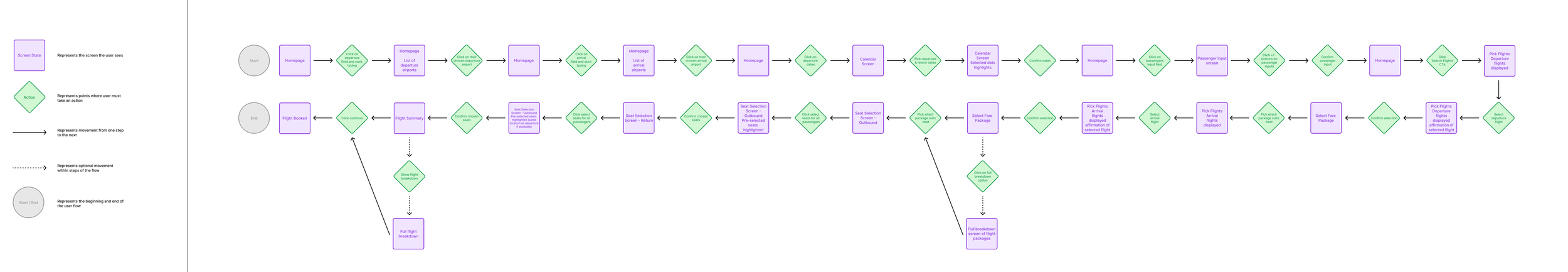
Creating a flow diagram helped to map out the entire booking journey and sequence of actions users would take to complete it.
Focusing on the 'ideal' path ensured a smooth and logical progression through each step.
Concept
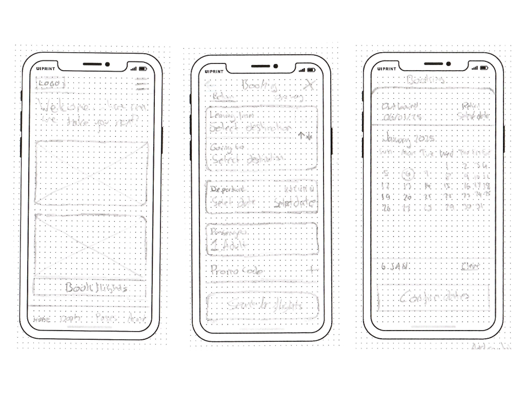
Sketching the Sky
To catch any potential problems in the journey early, I began the design process with low-fidelity sketches and wireframes to help quickly visualise the journey and workout any issues with the flow.
The sketches were based on the flow diagram and customer journey map, helping me to focus on the 'ideal' flow and not overcomplicate my designs. I also drew on inspiration from my competitor benchmarking and usability testing, noting common design patterns and mental models to make this journey easy for users to complete.
These sketches went through numerous iterations before finding the right balance between information and content, and they were consistently referred back to during the final design process.
Design
Final Boarding
Once I was happy with how the sketches were looking and how the flow was working, I moved on to mid-fidelity designs to test out basic interactions and work on the layout for the screens. This stage provided great insight when testing as it allowed me to validate important aspects of the solution including the flow, screen layouts, copy and key interactions.
To test my high-fidelity designs I recruited participants to complete a booking journey from start to finish. This gave me rich insights to how users would be using my app, what affordances the participants had, and any pain-points they had found whilst completing the journey.
I discovered during this testing that I had not completely solved the problems of seat selection. When conducting the testing the user stated '“It’s not clear that these seats are not available” and suggested an key or indicator would help to clarify. This was a great insight and one that was taken onboard with the addition of a simple ‘X’ helping to clearly show which seats are not available.

Design
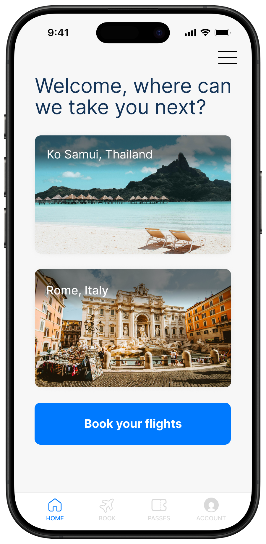
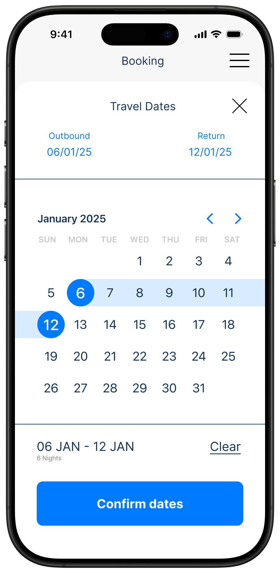
Flight Ready
At this stage all screens from the homepage to booking summary had been tested, iterated and tested again to make sure the flow worked as a solution to the problems found in our research and analysis stages. Here we have just a few screens from the final design. If you would like to complete the booking journey yourself please click the button below.